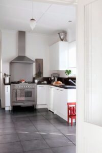
All kitchens are unique, but there are general standard kitchen layouts, and we recently came across this article on the Homes to Love website which explains the common configurations in a really clear way, so we thought it was worth sharing.
A kitchen is more than just a cooking space. It’s a hub of home activity, a point of pride and a place to socialize.
When it comes to planning your dream kitchen design you want to ensure maximum space efficiency and functionality.
Every space is unique but there are some standard configurations and common constraints that come into play in a kitchen renovation.
Check out some pros, cons and design tips for the six most popular kitchen design layouts.
1. Island kitchen layouts

The island layout is ideal for people who want their kitchen to be a social hub. It enables the cook to entertain while preparing food.
A successful kitchen island configuration requires plenty of room. “We recommend a minimum of 16m for a successful island kitchen,” says Sydney architect Kathy Roberts from design firm Hassell. “A long island bench is preferable and allows ample space for food preparation, socialising and a washing-up area.”
Islands can be designed with built-in sinks and hotplates, but operate best as a hub when free of cooking or sink facilities.
PROS
Island kitchens provide the ultimate connection between your kitchen and open-plan living spaces.
CONS
There’s nowhere to hide. Your kitchen is on display and the pressure to keep it clean is greater. The open connection between kitchen and living area means there is little separation when it comes to noise and activity.
DESIGN TIP
Make your island a major feature by shaping it into a unique form or using dramatic materials such as marble or timber. Also rectangular islands should be at least 2.4m long to provide harmonious proportions.
2. U-shaped kitchens

U-shaped kitchens are great for large families or where multiple cooks will be working simultaneously in the space. This layout is also flexible. It can work in both long, narrow galley-style spaces, as well as large square spaces with a central island workstation.
Where space permits, a central dining table set within the U provides a casual dining or workspace.
PROS
U-shaped kitchens can be placed adjacent to the living area, fostering a connection but allowing a degree of privacy from the open-plan living/dining zone.
CONS
A U-shaped kitchen’s large mass of cabinets can feel bulky if the detailing isn’t closely considered. This kitchen layout is also better suited to a period rather than modern home.
DESIGN TIP
Watch the gap! The area within the U can be any size, but if too wide it becomes inconvenient putting too much distance between work zones.
3. L-shaped kitchens

An L-shaped kitchen lends itself to a medium to large area and is ideal if you want to incorporate a dining table into the scheme.
Position tall units (pantry, fridge, wall oven) along one arm of the L, and the main bench (with cooktop and sinks) on the other. This will provide maximum bench and storage space, and plenty of circulation room for at least two people to work within the kitchen area.
PROS
Adaptable, functional, stylish and social. This is a very popular kitchen layout for houses.
CONS
Sometimes this configuration is all about fitting everything in and the flow when cooking may not be ideal.
DESIGN TIP
In an L-shaped kitchen, finish taller cabinets in a similar colour or material to the walls so they visually blend with the rest of the room.
4. Straight-line kitchens

This layout is best suited to compact spaces such as small open-plan apartments.
A larger-scale straight-line kitchen is also an option for families who like to dine in the kitchen.
This layout works well when the dining table is directly adjacent to the kitchen. The table can double as an additional prep area.
For a balanced look, position the fridge at one end of the long bench, with the oven, microwave and pantry tower at the other. The cooktop, sinks and benches should occupy the area in between.
PROS
This layout is ideal for square-shaped combined dining/kitchen spaces where constraints such as corridors, doors or windows may limit the amount of wall space for cabinetry.
CONS
Unless appliances like dishwashers and fridges are fully integrated, this kitchen design can be visually cluttered. An induction cooktop will also help streamline this kitchen layout.
DESIGN TIP
For a clean look, keep the floor finish consistent between the kitchen and dining/living areas. A tiled or timber floor will work best.
5. Galley kitchens

Galley kitchens are common in older and period apartments and narrow terrace houses with a small/medium-size separate kitchen.
They are a good way to utilise corridors; by incorporating all essential elements on either side of the narrow area, they make good use of all available space.
While more about function than socialising or eating in, the design is one of the most efficient layouts for compact homes in terms of design, functionality and meal production.
PROS
This kitchen design has the potential to utilise and transform a passageway into a highly functional space.
CONS
Galley kitchens can be dark and feel claustrophobic if there is no natural light or tall cabinets are overdone.
DESIGN TIP
Combine full-height cupboards and plenty of bench space with windows or skylights to open up the space, brighten it and add glimpses of sky.
6. Peninsula Kitchen

A peninsula layout is a practical solution for smaller kitchens that need additional workspace, storage or seating. The short return provides the benefits of an island bench but occupies less floor area.
PROS
It opens up the kitchen to the adjacent area, allowing for better circulation.
CONS
This layout creates a kitchen with unusable open space.
DESIGN TIP
A galley or straight-line kitchen might be a better option. Those are the kitchen layouts preferred by most designers.


